Painted Into a Corner: When Your Signature Style Stops Serving You
There's a moment every working creative knows. You open a blank canvas, a new document, a fresh project file—and instead of freedom, you feel the weight of expectation. Not from a client. Not from an audience. From yourself. Because somewhere along the way, you built something recognizable, and now it owns you more than you own it.
A strong visual identity is the goal. Consistency builds trust. It makes you memorable. It's the thing that makes someone scroll past a dozen other portfolios and stop at yours. But that same consistency, left unchecked, has a way of calcifying. What started as a point of view becomes a formula. And formulas, no matter how elegant, don't grow.
How Signature Becomes Straitjacket
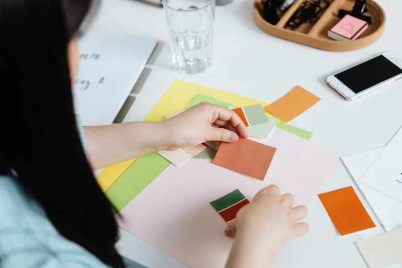
It usually doesn't happen all at once. You find a palette that resonates—maybe a muted, earthy range that photographs beautifully and feels distinctly yours. Clients respond to it. You lean in. You get known for it. Then one day, a project comes along that practically begs for something bolder, something cooler or more electric, and you hesitate. Not because it wouldn't work, but because it wouldn't look like you.
That hesitation is the aesthetic trap in action.
The same thing happens with typography. You find a pairing that feels right—maybe a geometric sans-serif and a high-contrast serif—and it becomes your handshake. Clean, reliable, distinctly yours. But after a few years, you're not choosing it because it's the best tool for the job. You're choosing it because it's the safe one. The one that won't raise eyebrows.
Consistency and rigidity look almost identical from the outside. The difference is intention.
The Brand Recognition Trap
Here's the uncomfortable truth: clients often reward rigidity without knowing that's what they're doing. They hire you because they saw a project that looked a certain way, and they want that. They're not thinking about your evolution as a creative. They're thinking about their deadline and their deliverable.
So you deliver what they expect. And then you do it again. And again. And before long, your portfolio is a greatest hits album of the same three aesthetic decisions executed with slightly different content.
That's not a body of work. That's a loop.
The irony is that the visual identity you built to stand out eventually starts to blend you in—not with other designers, but with older versions of yourself. You become your own competitor.
Staying Distinctive Without Being Predictable
The goal isn't to blow up everything you've built. That's not evolution—that's panic. The goal is to stay genuinely curious inside a recognizable framework.
One way to do that: separate your brand identity from your creative range. Your brand identity is what clients see on your site, your social presence, your proposals. It's the consistent face of your business. Your creative range is what you're capable of—and it should always be wider than what you regularly show.
Give yourself permission to work outside your signature in a context that doesn't carry client stakes. Personal projects, experimental pieces, collaborations with other creatives. Not everything has to be portfolio-ready. Some work just needs to exist so your instincts don't go stiff.
Another strategy: audit your visual choices with the same rigor you'd apply to a client's brief. When you reach for that familiar palette or that trusted typeface, ask honestly—is this the right choice, or is it just the comfortable one? Sometimes the answer is both, and that's fine. But sometimes it's only the second, and that's worth knowing.
Letting the Work Breathe
Some of the most interesting creative work happens when a designer or artist deliberately introduces friction into their own process. That might mean working in a medium that doesn't come naturally, setting a constraint that rules out your default choices, or simply asking what this project would look like if someone completely different made it.
That last question isn't about abandoning your voice. It's about stress-testing it. If your answer is basically the same regardless of the constraint, you might not have a style—you might have a habit.
Visual identity should be a starting point, not a finish line. The creatives who maintain longevity aren't the ones who found their look and locked it down forever. They're the ones who kept asking questions even after they had answers that worked.
The Permission You're Waiting For
If you've been quietly wondering whether you've outgrown your own aesthetic—you probably have. That restlessness isn't a sign that something's broken. It's a sign that you've grown past the edges of what you originally built.
The aesthetic trap only stays a trap if you treat your visual identity as something fixed and final. Treat it instead as a living thing—something that can absorb new influences, shed what no longer fits, and still remain unmistakably yours.
Your look doesn't have to stay the same to stay recognizable. The most distinctive creative voices aren't static. They're consistent in perspective, even when they're unpredictable in execution.
That's the difference between a signature and a ceiling.