Designing for the Scroll Without Selling Out the Frame
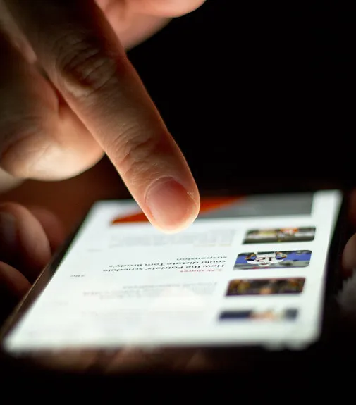
Photo: Japanexperterna.se, CC BY-SA 2.0, via Wikimedia Commons
There's a number floating around every design studio and brand meeting right now, and it isn't a budget figure. It's the amount of time a piece of visual work gets before a thumb keeps moving. Estimates vary — some say 1.7 seconds, some say three — but everyone agrees on the direction: down.
This is the water we all swim in now. A generation of Americans formed their visual taste on TikTok, Reels, and YouTube Shorts, where the crop is vertical, the pacing is brutal, and anything that doesn't grab gets swiped into oblivion. And whether or not you've ever opened the app, its logic has colonized everything: portfolio sites, album art, museum exhibitions, even book covers. The question isn't whether short-form attention affects your work. It's whether you're designing for it deliberately or getting dragged along by it.
What the Scroll Actually Changed
Let's be precise about what compressed attention did and didn't do. It didn't make people unable to focus — anyone who's watched a teenager sink four hours into a video game knows that's nonsense. What it changed is the entry price. The first impression now has to clear a much higher bar, faster, in a smaller frame.
The practical consequences are everywhere. Logos are being simplified not because flat design is fashionable but because a detailed mark turns to mush at thumbnail size. Portfolio sites have shifted hero imagery from wide desktop compositions to something that reads on a phone. Type got bigger. Contrast got louder. Negative space, which once signaled sophistication, now risks reading as emptiness.
None of this is inherently bad. Big, bold, legible work has always had virtues. The danger is subtler: when the three-second test becomes the only test, design starts optimizing for the glance and abandons the gaze. And the gaze — the slow look, the detail that reveals itself over time — is where a lot of the best work actually lives.
Two Audiences, One Piece
Here's the tension worth sitting with: every piece you ship now faces two audiences simultaneously. The scroller, who gives you seconds. And the visitor, who might give you minutes — the client who bookmarks your portfolio, the curator who lingers, the person who buys the print.
The mistake is choosing one. Work designed only for the scroll tends to be loud, front-loaded, and forgettable the moment after it lands. Work designed only for the long view tends to be invisible — genuinely good things nobody ever stops for.
The craft is layering. Think of how a great poster works: the headline reads from across the street, but the texture, the kerning, the little joke in the footer reward the person who walks up close. That's the model. Design the surface for the thumb and the depths for the eyes.
Tactics That Hold Both
Front-load the idea, not just the image. Ask what your piece is about and make sure that idea survives at 200 pixels. If it only works at full screen, it only works for people who already care.
Test in the feed, judge in the frame. Screenshot your work at phone size and scroll past it quickly — does it stop you? Then view it large and slowly — does it hold you? You need both yeses.
Build a slow layer on purpose. Details, process shots, a written note about the thinking. These don't perform in the feed, but they convert the people who stay.
Resist the loudness arms race. When everyone shouts, the shout stops working. Sometimes the most scroll-stopping thing in a feed of saturated chaos is restraint — a quiet frame, a single color, real whitespace.
The Long View Isn't Dead. It's a Choice.
The scroll isn't going anywhere, and pretending otherwise is professional malpractice. But short-form attention is a distribution reality, not a design philosophy. The creatives who'll matter in ten years are the ones who use the first three seconds to earn the next three minutes — and who still make work worth returning to after the trend cycle turns over. Design for the thumb. Build for the eyes. Refuse to pick just one.